
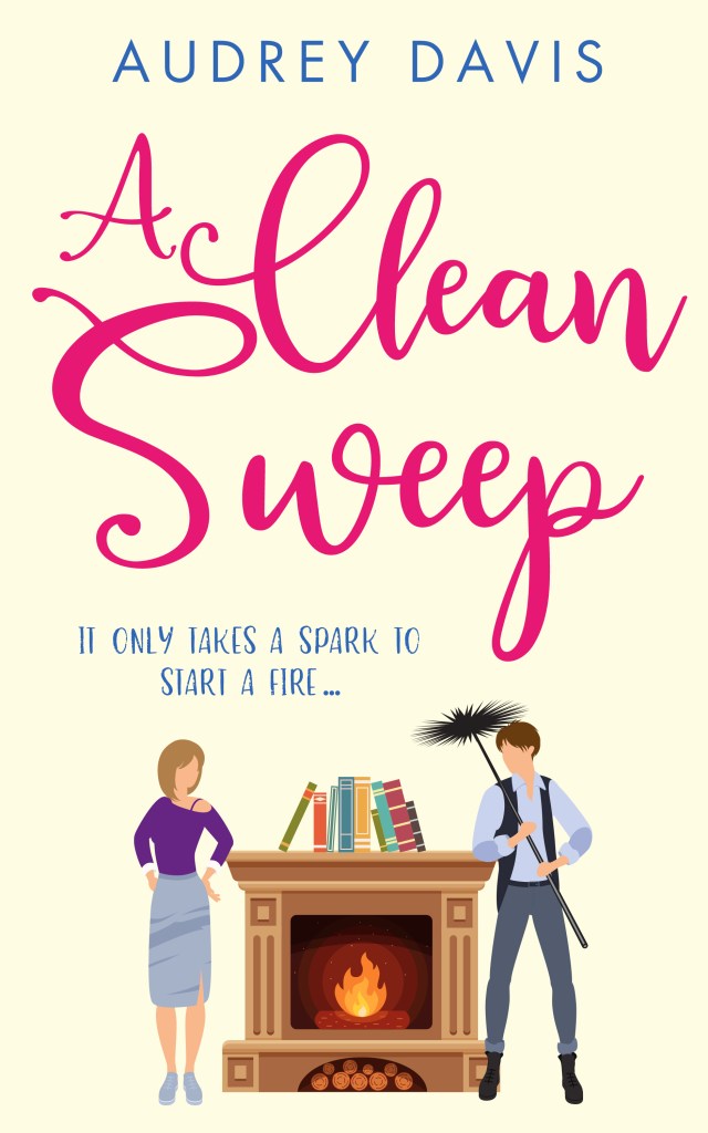
You can pretty much judge a book by its cover. Everyone knows that. But what if you just can’t work out what the cover should be? This is the problem I had when I self-published a novel at the end of last year, and when Writing Magazine commissioned me to write a piece about it, I set out to try and work out some answers.
It was the book seller who really threw me. “Your book looks like YA,” he said, before leading me around the shop, pointing out a range of best-selling covers – none of which bore any relation to my own.

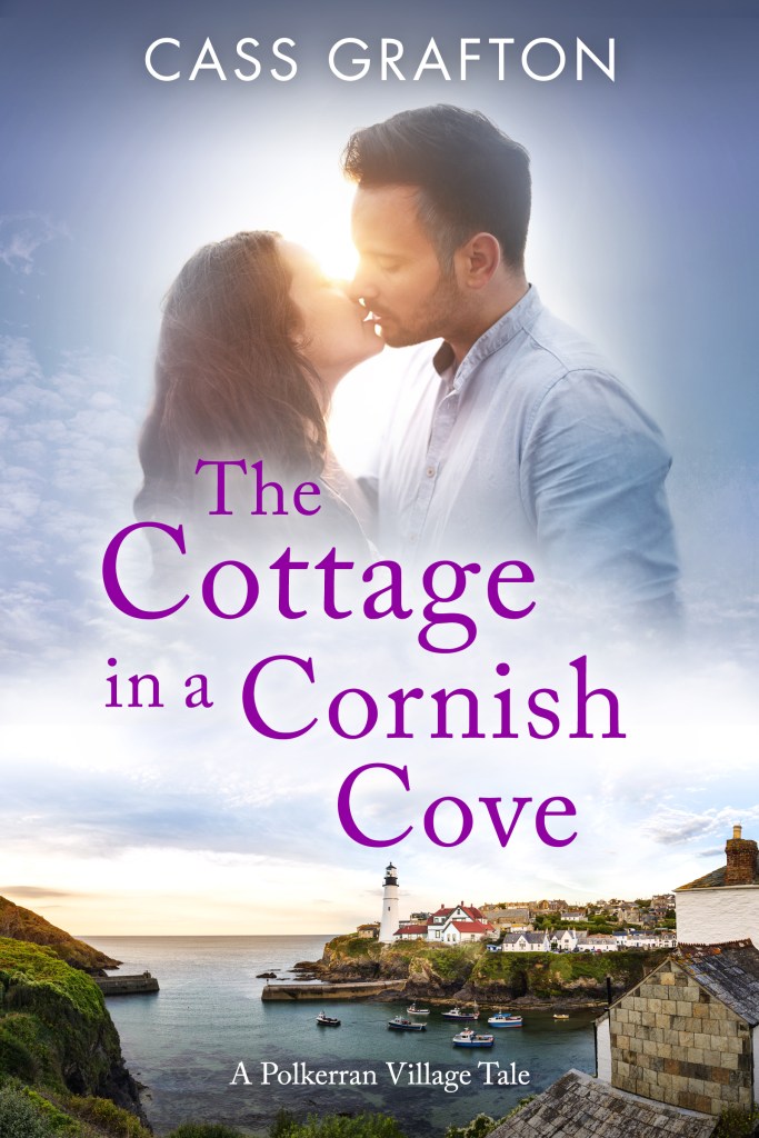
Shoot the Moon is a contemporary romance with comedic elements. However, with themes of baby loss and commitment avoidance it also crosses over to women’s fiction. So pretty quickly after publishing I decided that, although lots of people loved it, I did have the wrong cover, and it was limiting my audience, and so began a journey to find out more about the sub-categories within the romance genre.
The first thing I wanted to clarify were the main sub-categories. Anne Williams is a well-known book blogger and the RNA Media Star of 2019. Of the four to five books she reads a week most tend to be romance, so she seemed the perfect place to start. She suggests that the RNA (Romantic Novelists Association) annual awards are a good place to look. Here, the categories are divided into six main ones: contemporary, historical, saga, rom com, romantic thriller and fantasy.
Another former RNA Media Star, Linda Hill, (who also reads up to five books a week) thinks there are many more. “The sub-genre is increasing in the UK. There’s the vampire romance within YA. There’s LGBTQ+. Regency Romance is a complete genre in its own right – boosted by the popularity of Bridgerton – and there’s now comedy Regency too.
“If you’re trying to self-publish, the thing to do is to read widely and see where your book fits within the things you’ve read and then look at those covers. Rather than say, I think I’m in a particular genre, right what covers do they have. Go via the inside first.”
When I ask whether chick lit is still a category, everyone has very different answers. “I think it died in the 1990s,” Anne suggests. “Now, I think you’re talking about the split between contemporary romance and women’s fiction. Chick lit is such a derogatory term. It always amazes me when I see writers describing their own books that way as to me it’s such a put down. Again, I think people sniff at rom coms, but I’ve read some very multi-layered and nuanced books within the genre.”
“I believe chick lit does have traction,” says Linda, who suggests defining features include having fewer characters and less themes than contemporary romance: “It’s something to read and enjoy in a couple of hours, move on and not give it much more thought. The term is seen as derogatory but the genre is an important one. Why shouldn’t there be happy ever after, fairly clichéd stories if that’s what people enjoy reading and it brings joy to their lives?”
Jan Jaggard, manager of Waterstones in Dorchester agrees. “I’m not personally offended by the moniker. It’s a good umbrella term for the lighter, summery beach-read type books. Some authors are purposefully writing to be light and entertaining. The fact that it’s often formulaic, with tropes, means you know you’re on safe ground and that all is going to end well.”
However, Lisa Firth, winner of the RNA’s inaugural cover designer prize and an award-winning author of 13 novels, feels ‘chick lit’ is problematic. “I tend to call my books with less romance: humorous women’s fiction,as like some other authors, I’m not a big fan of the term. However, it is a description used by booksellers and some readers to describe a popular genre, so unfortunately can’t be entirely ignored. It tends to feature a young woman (as younger women tend to read it) and needs to have a humorous element; so there’s a crossover with rom com. But while all rom coms are chick lit; not all chick lit has romance.”
Personally, I agree that the term is sexist and reductive, so will call it ‘light-lit’ for the purposes of this article. And everyone is keen to point out that good narratives require good writing, whatever the genre or sub-genre. “I think there’s the perception of there being a difference in quality between categories,” says Anne, ‘but I don’t think that’s true. There’s some fine writing across the board.”
“It’s a bit like cooking,” says Linda. “Pancakes are essentially easy, with limited ingredients, but my goodness some are stodgier than others.”
The Hierarchy of Romance

Women’s Fiction: All romance is women’s fiction (for even when written by men, women generally comprise the primary readership). In women’s fiction there might be romance but it’s not always the driving force of the narrative. Neither does the story necessarily have to have a happy ever after. Meaning it’s often a weepier read, and themes can be grittier.
Romance: An important generic convention for romance is that all of the following should have a happy ever after, or a happy for now. All (apart from erotic) can also have ‘open door sex’ but not pages and pages of it. Word count averages 80 – 100,000.
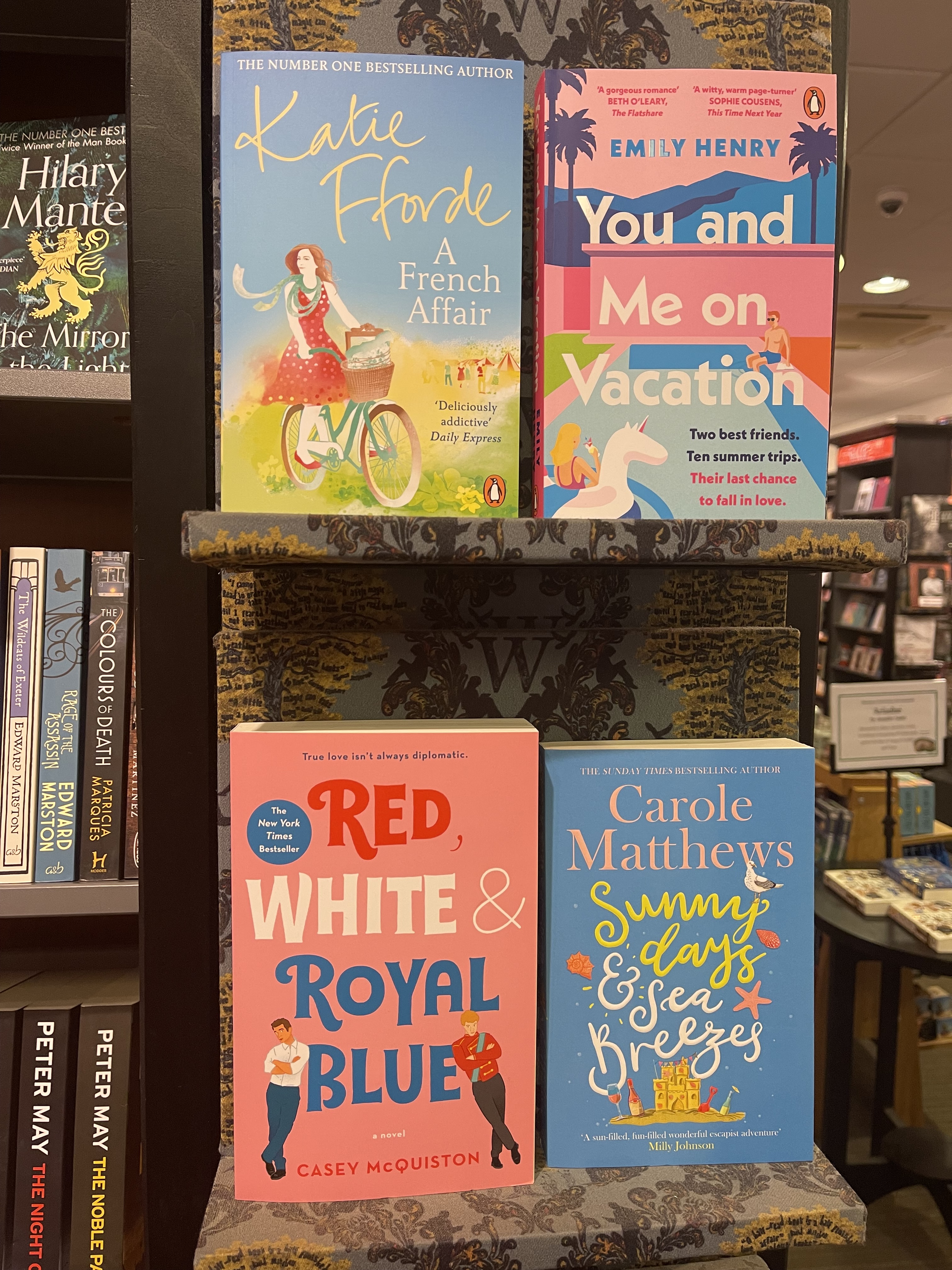
- Light Lit/Rom com: smaller cast of characters; generally late twenties/early thirties. Often includes tropes and a familiar plot arc. Can have sub plots as well as the core romantic plot. It’s important that the heroine is relatable to the reader. “She’s the reader’s avatar within the book. Usually someone you feel could be your friend and you’d like to hang around with.” Rom coms should be “consistently funny”.
- Contemporary: set predominantly within the past fifty years. The narrative revolves around a developing romance between two people. Not necessarily a new one, it could be exploring a long-term relationship. Has other themes too – covering a spectrum of light and dark – giving it more emotional impact than light lit.
- Historical: defined as pre-1980
- Regency and WW2 are two biggies in this category
- Romantic thriller/suspense: set in any time period and featuring suspense, mystery or crime entwined with romance.
- Saga: Predominantly set pre-1950. Usually a young working-class woman making her way in the world. Tends to involve more hardship. Originally based around a family, spanning generations.
- Category: Averaging 50,000 for Mills and Boon and Harlequin, which generally focus on two people. Maximum of 70,000 words for historical.
- LGBTQ+: Romances which feature lesbian, gay, bisexual, transgender, or queer people as the main characters. They may also feature other minority sexual orientations/gender identities, such as asexuals, demisexuals, pansexuals, Two Spirit, non-binary or a-gender persons, among others. Particularly popular as contemporary romances, but you can also find paranormal, historical, sci-fi/fantasy, romantic suspense, and other sub-genres.
- Young Adult: not necessarily just for young people.
- New Adult: involving protagonists in their twenties. More popular in the US than the UK.
- Fantasy/Speculative: paranormal, supernatural, timeslip, magical realism, sci fi, shifter and stories with ghost elements
- Erotic: contains a considerable amount of sex. Different to erotica, which doesn’t necessarily have a romance.
Narrative Point of View

The lines are most blurred between light lit/rom com, contemporary romance and women’s fiction, and I wonder if narrative point of view is a clear delineator. In the 1990s, when there was the first attempt to reassess the more commercial end of women’s fiction, super-agent Jenny Bent commented that publishers were asking authors to transcribe books from first to third person as the former was seen as “too chick lit”- a star that was felt to be waning.
Today, there remains differences of opinion. Jan suggests first person is still more likely to represent the lighter end of the genre, while Lisa doesn’t think it matters either way. Anne sees both positives and negatives: “I think if it’s first person you can identify with the character more strongly because you’re sharing their thoughts; but some people are maybe put off by it. Something you see quite a lot of is head-hopping done badly, which can make you feel quite dizzy.”
One thing there has been is a shift in the age ranges represented in romance. “Those of us in our sixties are not actually washed up and averse to romance in our own lives, so I think there’s a slight move away from that,” says Linda. Anne agrees that she looks for books with older characters for, “the ones in their twenties leave me cold.”
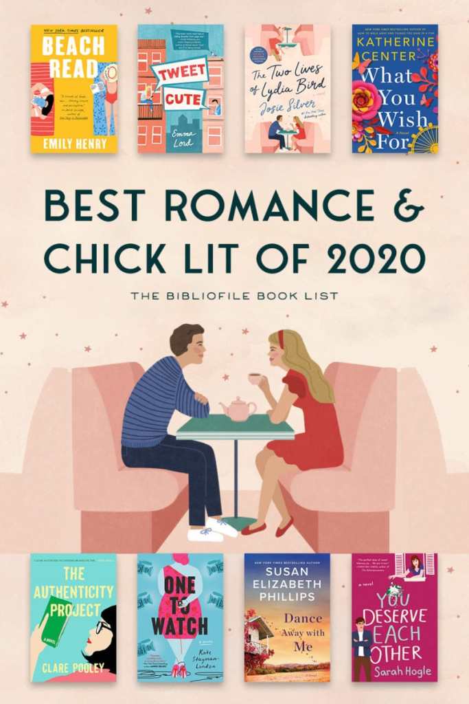
A publisher that is certainly promoting older protagonists is Boldwood Books. With more than five million sales since its inception in 2019, it’s a game changer within the industry. Looking at its website, one of the things that’s immediately obvious are its streamlined book categories: crime and mystery, historical, romance, saga, thriller and women’s fiction. And what’s particularly interesting is that in the latter category there are many cartoon-illustrated covers – like Lil’s Bus Trip – amongst the scenic view photos and watercolours.
Founder and CEO of Boldwood, Amanda Ridout, suggests that, ‘The publishing industry tends to get obsessed with categories, while readers’ tastes are more wide-ranging and encompass several genres. A cover needs to represent the spirit of the writing and offer a promise to its potential consumer, not pigeonhole the story.’
So, with publishers like Boldwood doing even more to blur the lines, how can we break down the main signifiers for the broadest categories? If we work to a hierarchy of light to heavy, it might vaguely look something like this:-
Light Lit/Rom Com: Cartoon-style illustrations and block primary colours. Title typeface: often a curly script or fun handwriting-style font – sometimes a mix of the two. “A man and a woman signifies the story is mainly going to centre around a romance.”
Contemporary Romance: May be illustrated or photographic in style. Illustrated covers are less light-hearted in tone; often in a painted watercolour style. Sometimes film-poster. More likely to feature figures of the primary couple than general women’s fiction. Title typeface: usually serif.
[Note: “There’s a term “book club fiction”, which may be general women’s fiction, romance, literary fiction, or anything else likely to get picked up by book clubs. Some publishers are keen to have their more serious romance titles cross over into this category. For this reason, I’d say there’s a trend for contemporary romance titles to feature figures of couples less frequently than in the past, to signal they’re not solely romance.” – thanks Lisa!]

Women’s Fiction: Can be painterly, photographic or watercolour. Typeface more likely to be serif. May feature a lone female figure to signify the genre.
Literary Romance: More likely to feature everyday objects (a toothbrush etc). There are some with illustrated figures, but these will be more sophisticated in style. Typeface usually sans serif.
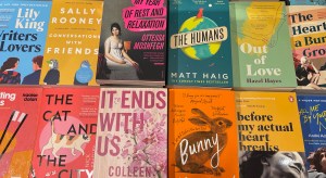
What is immediately apparent if you look along the lines of bookshelves is that it’s impossible to come up with definitives; not least because styles are constantly changing; including publishers mirroring other successful covers.
What is often mentioned is a lack of desire for real people. “I cannot convey how much I dislike them on covers,” says Linda. “They remove the chance to create a character’s appearance in my mind’s eye and amount to showing not telling. Very often their position seems so contrived that it puts me in a negative mood before I begin and may mean I miss some excellent fiction.”

“When Josie Silver’s One Day In December was a big hit,” says Lisa, “a similar cover style became popular for rom com: minimalist, bold text on a cream cover and a simple but sophisticated line drawing. That style isn’t now as prevalent but is still popular.”
The Blurb
So, if it’s impossible to absolutely tell a book by its cover, is the blurb the defining element? Linda places its importance at 80%, and Anne, who only reads on Kindle, ranks it even higher.
Jaggard, however, has some words of caution. “Most people will look at the blurb, as well as the first few pages or the middle to see if they’re going to like it. But in the shop we often say things like, ‘Don’t look at the back because it sounds bloodthirsty, but it’s not. People do accept the blurb can’t say everything, but sometimes it’s as off-putting as the cover can be. And we often see books where the content just isn’t what it says on the tin and readers find that really irritating.”
One of the reasons Linda gives for the importance of the blurb is because of the homogeneity of both covers and titles. “For example, I’ve reviewed two books this year called The Therapist. I would say this approach started happening maybe three years ago but more so over the pandemic. I think that because people haven’t been in shops browsing and looking at blurbs, covers have become generic so that people can order things on line knowing they’re going to get a similar sort of story.
“But for me if it feels like too generic a cover I may well just bypass it and look for something else that feels a bit more individual, more unique – so it might have the opposite effect. I’m getting to the point where I’m not reading books that I’d actually probably really love because the cover feels so clichéd. I think, does that mean the writing’s going to be like too? I do a whole load of questionnaires for various publishers and in every single one I say I don’t like this, it’s exactly the same as all the other covers I’m seeing.”
Same but Different
So how does someone tell what a book is from its cover when on the one hand there’s too much variety to be able to absolutely pin down its sub-genre, and on the other, so much homogeneity within genre categories that, as Firth says, “in book groups you sometimes hear people complaining that they thought they’d already read a book, but actually hadn’t.”
And, more importantly for authors, how do they work out how to market their novel?
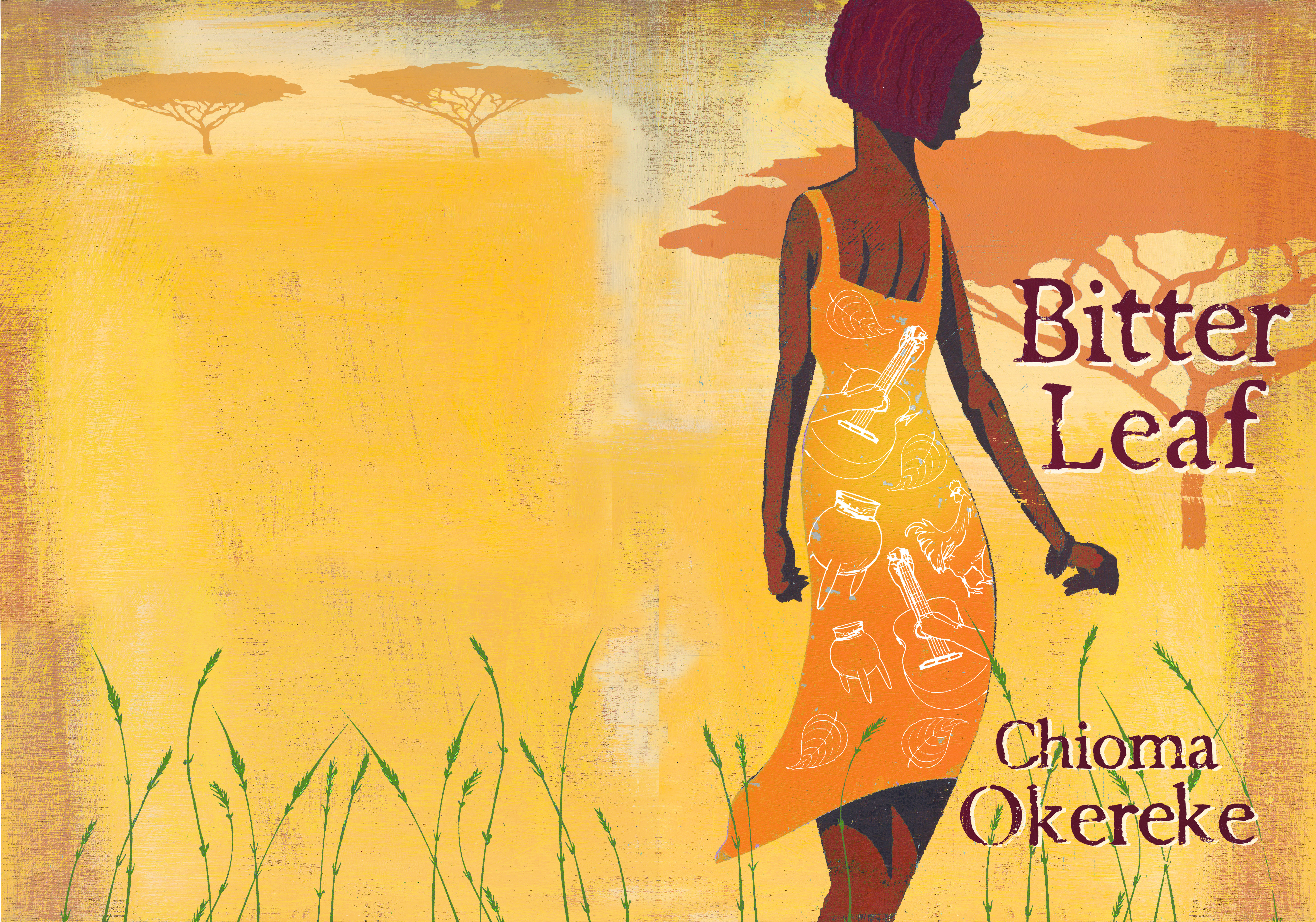
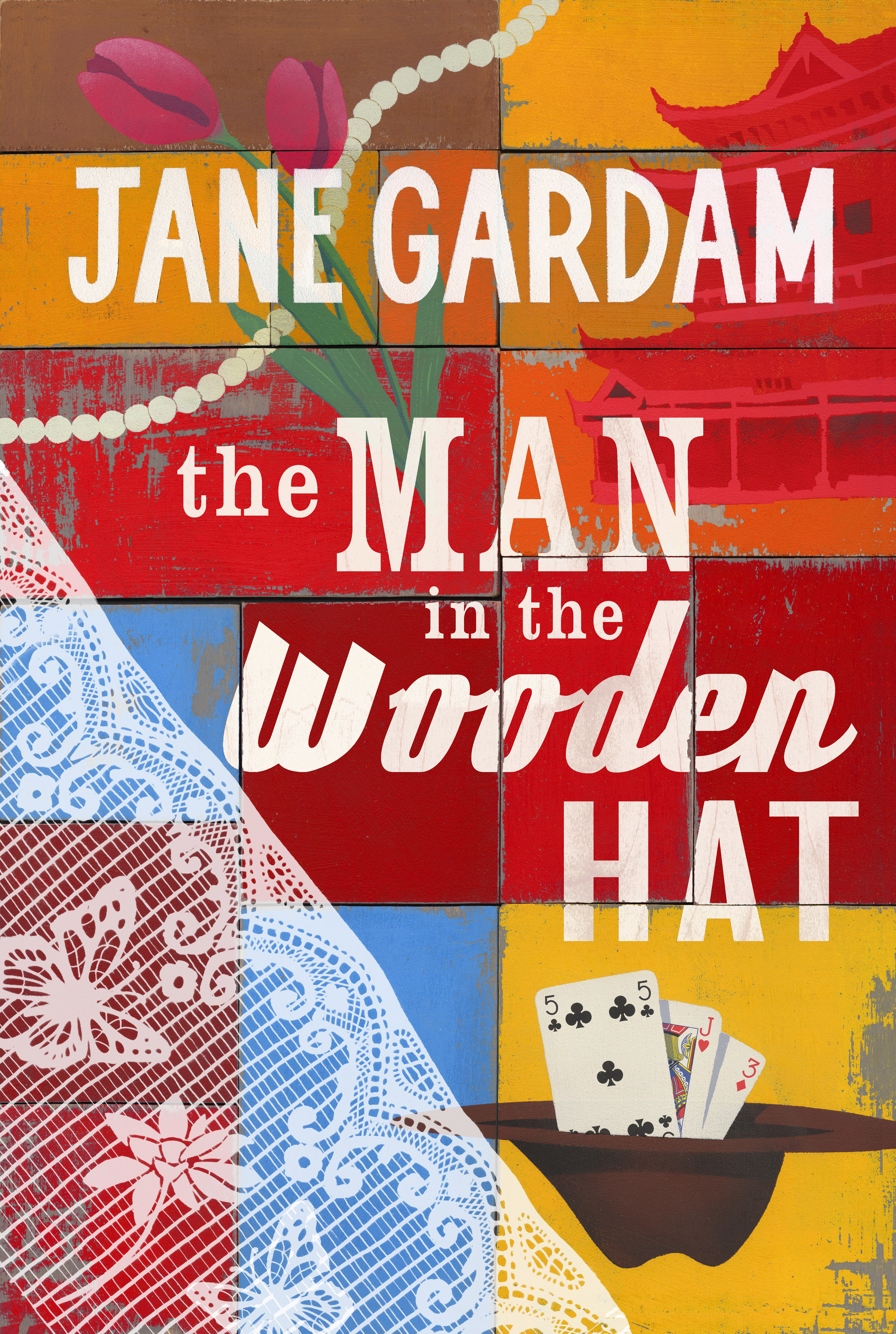
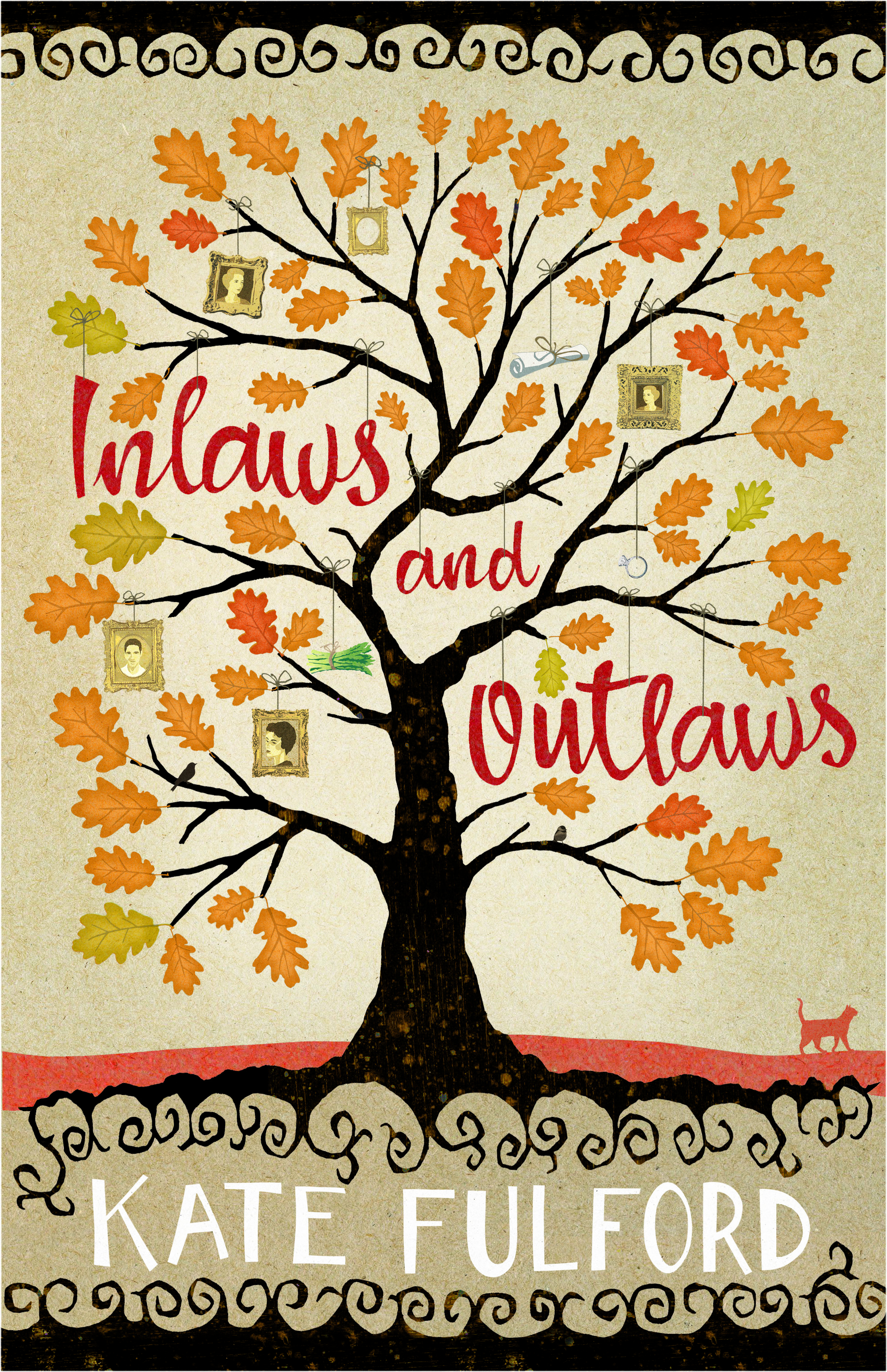
“‘Same but different’ is something I get asked for a lot,” says Andy Bridge, whose unique woodcut and metal mixed-media illustrations adorn the covers of authors as varied as Hilary Mantel, Alexander McCall-Smith, Yann Martel and Meg Wolitzer (see example work below). “And that’s quite a difficult thing to get your head around as it’s two opposite ends of a scale.”
Firth agrees. “You want your book to look like it belongs to its genre – you don’t want a thriller that looks like a romance or vice versa. So you need to choose things that signal that. But at the same time you don’t want it to look like every other thriller on the shelves, especially at thumbnail size. People want you to produce something that’s unique to them and represents their story. But commercially, at the end of the day they want readers to read their book. So it is a case of same but different.”
And then there’s the issue of genre cross-over – for instance between contemporary romance and women’s fiction. “We see this a lot,” says Jan when I show her my own book cover. “My advice would be to always go for the ‘top’ level. So, you should market this as women’s fiction. Whereas your cover screams rom com to me, and little else.”
Firth also suggests you just focus on one category. “Whether it’s for a big publisher or an indie-author, the designer has to decide which readers the book is mostly targeting. It’s quite difficult to show something that’s women’s fiction, serious romance, has got some humorous elements and a suspense plot. If you try and signal all these it’s going to end up not looking like any genre. I do try and hint at all the elements, but the main focus is to think of the biggest group of readers and try and create something that will appeal to them.”
Books without Borders
Another solution, if you find categorising your book too hard, is to move away from genre altogether. Andy admits that it’s not something he’s ever paid much attention to. “I don’t go out and try and fit into one specifically, but I suppose the art directors know my style so they’ll have thought that through before they even get to me.”
At this point I’ll put my hands up and say, this is the conclusion I reached personally and yes, Andy is re-designing my cover. So I thought it interesting that when I show his work to Lisa, nervous that it doesn’t shout ‘contemporary romance’ she suggests, ‘there’s nothing that excludes it either.’ She then adds, to my great relief, ‘If you’ve got one of his covers you’ll appeal to people regardless, because they’re beautiful.’
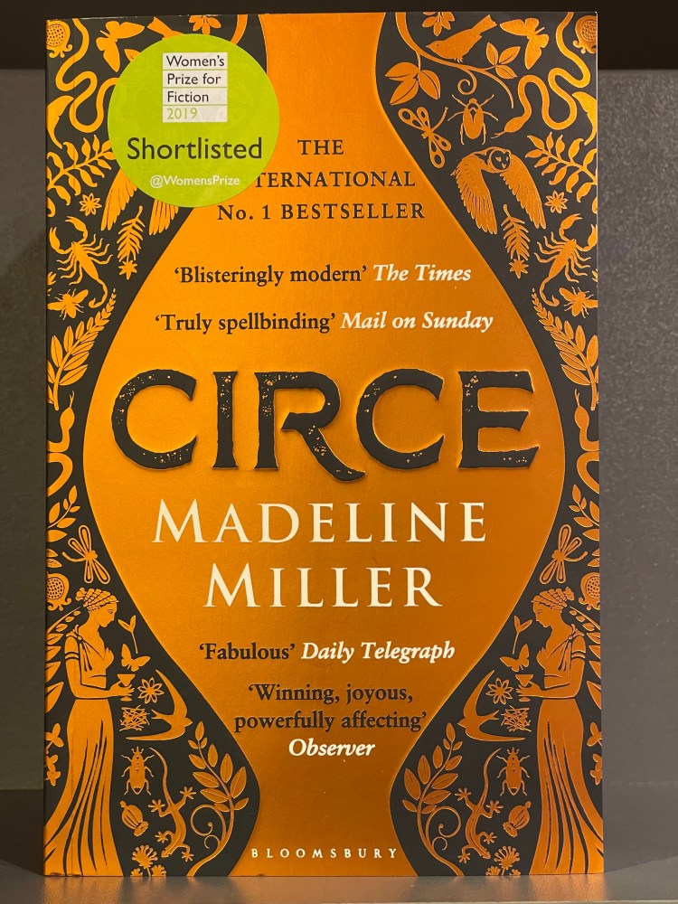
This is something echoed by Jan: that when you’re stuck between a rock and a hard place, you should consider going down the route of something offering universal appeal. “Over the past ten years I feel like jackets have improved immensely and publishers have invested an awful lot in design. Now they’re often a work of art and help us sell books. But we would love more jackets that appeal to everyone. For instance, Madeleine Miller’s jacket is just beautiful: the gold and the Circe word really stand out. We see people buying it just because of the cover. Unattractive book covers can be repellent, but a beautiful book cover can draw people in.”
In fact, this is a point on which everyone agrees. “I think going the route of just choosing a beautiful cover is the right decision,” says Anne. “Because if your blurb is good enough, people will pick it up because of the cover and blurb. And to a casual browser, the combination can make a real difference.” Andy agrees. “If I thought the cover was really beautiful it would make me want to read the blurb.”
Obviously traditionally published authors still have very little say over their covers. Although as both an author and designer, Lisa has an interesting perspective. “It’s much more difficult to design your own books as you’re just too close to the story. So you do take the advice of your editor and the designer and think, well if they think that’s best…”
However, for self-published authors navigating their way through the quagmire of genre signifiers, I’d suggest there are two main approaches to take. The first is to create a cover that is ‘same and only a little bit different’, mimicking many of the genre conventions of your ‘top’ category in order to attract the maximum readers.
The second is, as Jan suggests, to “Go with something you love personally that makes your heart sing. So you can proudly look at it in ten years’ time and think, ‘I was absolutely right about that. And I still love it now.’”
For me, that’s the approach I’m taking – and yes, it’s possibly more a personal than a commercial one. But it took me six years to write and publish Shoot the Moon. So why wouldn’t I want a cover illustration that matches my artistic sensibilities? One I love so much I’d happily hang it on my wall for the hand-crafted art that it is. And, she whispers slightly nervously, damn the genre.

Lisa Firth’s Tips for Indies
- Don’t scrimp on your editing as the finest cover won’t save you from bad reviews
- Don’t scrimp on the cover design as it’s the most important sales tool. A cover that looks unprofessional, as if it’s been amateurly designed, can definitely deter people
- Try to ensure your book is produced as closely as possible to the standards of a professional publishing house. Readers won’t differentiate between indie and the big four – they’ll just notice the title, the cover, shout line and blurb.
- Don’t underestimate how important it is how your book will appear at thumbnail size. The choice of typography and colour selection are vital when it comes to attracting readers
- If you are on a budget then pre-made covers are a really good option. Try the Book Cover Designer or some of the marketplace groups on FB. The standard is mixed (and often focussed on the US market) but some of it is really good
Lisa can be found www.fullybookeddesign.co.uk and Andy is at www.andybridge.com. Both are accepting new commissions. Follow Anne’s blog at www.beinganne.com and for Linda’s go to www.lindasbookbag.com. For Boldwood Books go to www.boldwoodbooks.com
This article was originally commissioned by Writing Magazine, and appeared in its March and April 2022 issues.

One thought on “Cover Conundrums”